Cauze
Redefining a platform for the future of philanthropy.
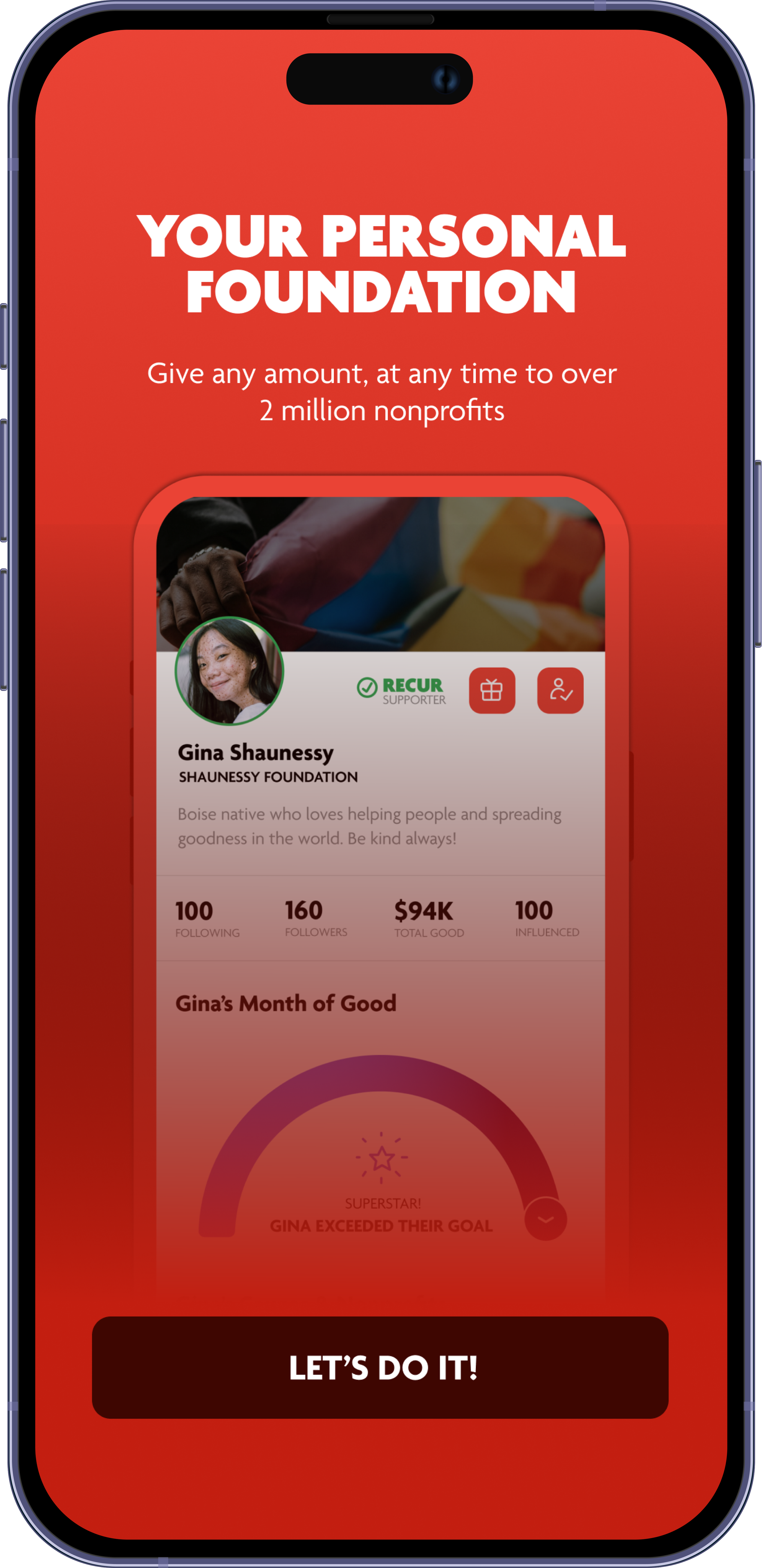
Cauze is a social giving app that enables users to donate to over 2 million nonprofits in the US, UK, Canada, and Australia. In 2022, the app required a visual overhaul and improved functionality. The challenge was to do a complete redesign that would not alienate existing users. I had responsibility for the following
Challenge
-
A comprehensive change of the design language of the app including a more streamlined UI / UX
-
Users wanted a more consistent experience. We also wanted to establish standards to allow for rapid design and build cycles.
-
We wanted to introduce an easier way for users to track their giving, analytics, checkout and more robust social tools.
-
The development process was missing design direction. My responsibilty was to work with dev teams to ensure an adherence to design standards
ROLE: Lead Designer
DATE: March - November 2022
TOOLS: Adobe XD, Figma, FigJam, Photoshop, Illustrator, Jira
Where it started
The original Cauze app saw an incremental introduction of features over many years that led it to become visually cluttered and confusing for users. It had a passionate user base that was eager to see the addition of new features while preserving parts that made it their go to giving app. In the process of making improvements, the visual style became cumbersome to manage as it had long outgrown its initial purpose.
Feature mapping
Leading a team of 3, we used FigJam to map out user journies and use cases of the app. We investigated user motivations using Typeform surveys. I then collated all the feeback to come up with a representative view of areas of focus.
DEFINING THE SOLUTION
After building a clear picture of user expectations, resource and the challenge, it was critical to define a design led solution. The simplified user flow was as follows:
A question I asked was:
What will bring users back into the app and encourage ongoing usage?
INTUITIVE ONBOARDING
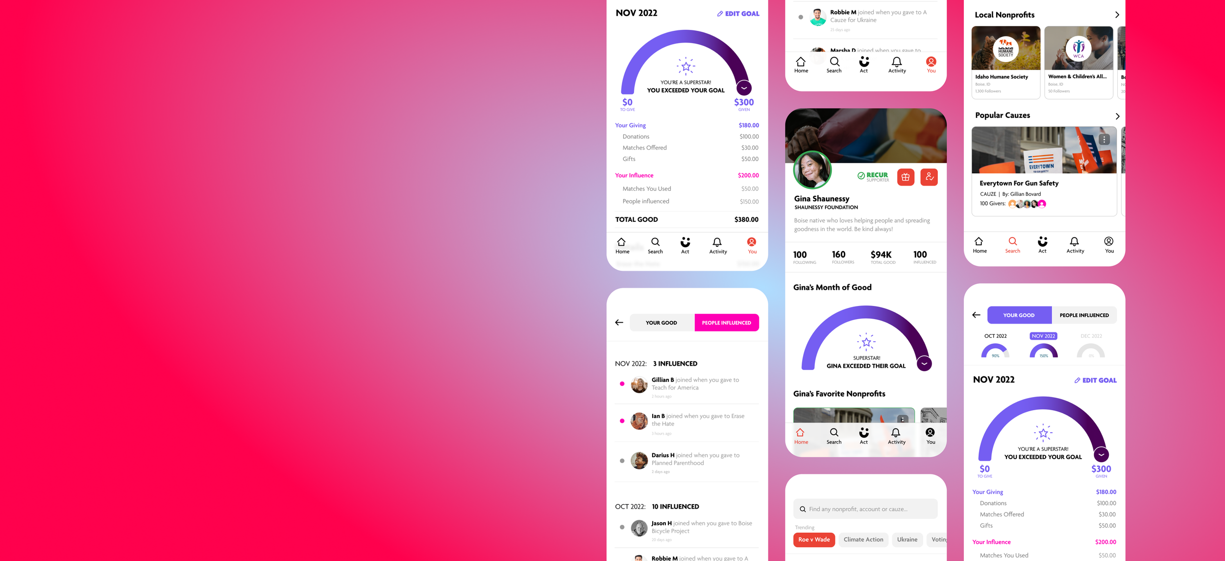
REIMAGINED PROFILE
REIMAGINED FEED
FAST, GRANULAR SEARCH
IMMERSIVE CONTENT
IMPROVED ‘JOIN’ UX
ACTIVITY CELEBRATION - LEADERBOARDS,
’GOOD’ SCORE,
INFLUENCE TRACKING
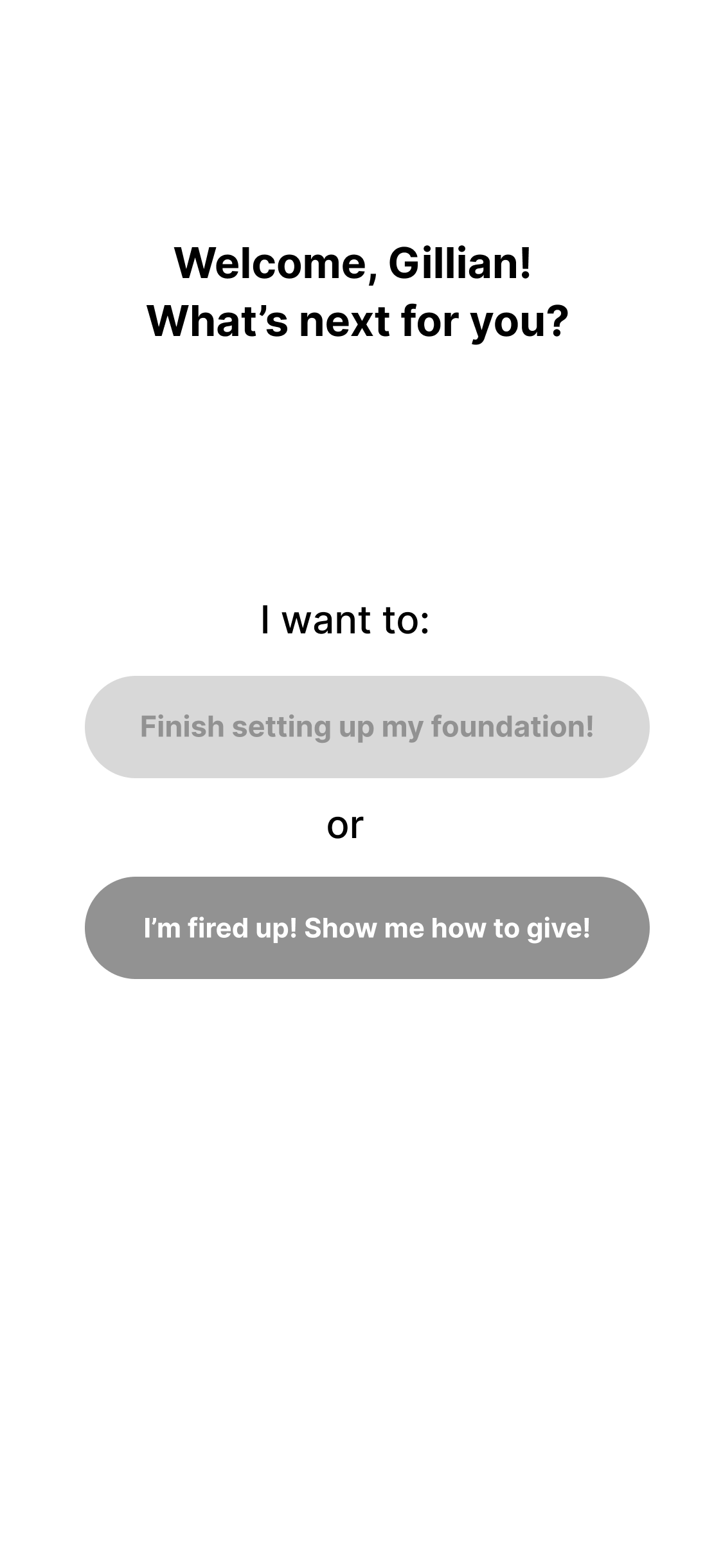
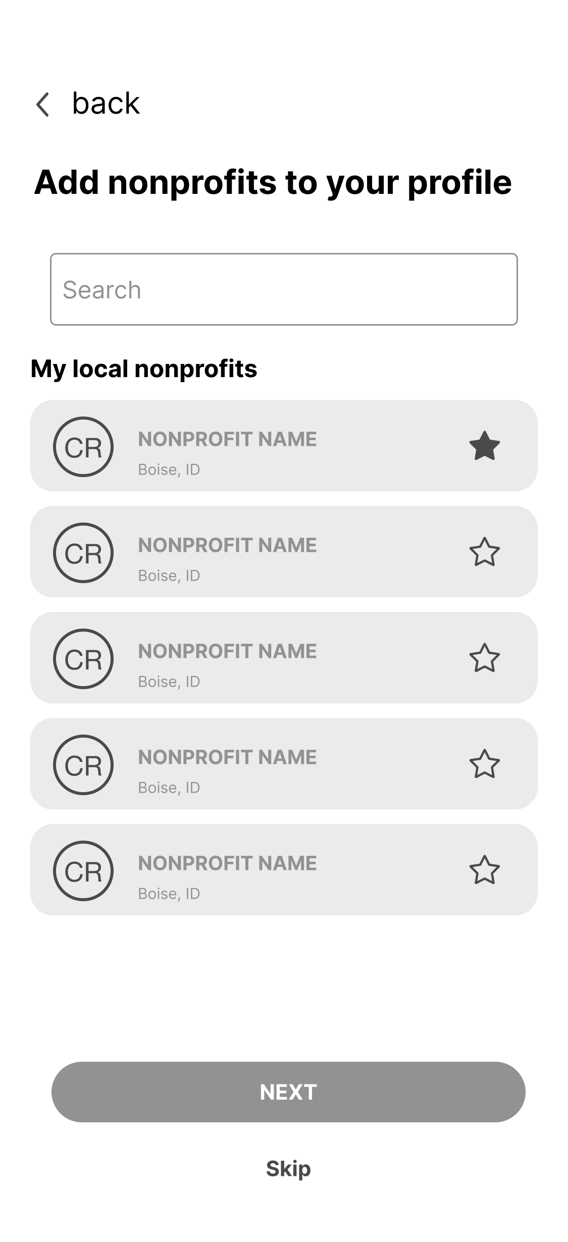
Wireframe samples
These are sample wireframes from the onboarding flow designed to incorporate the new direction based on user feedback.
Branding +
visual fluency
I decided to introduce a simplifed design system and a minor update to the company brand. The aim was to make collaboration across engineering and product teams a lot easier. This would also allow for rapid prototyping of ideas before we moved on to the build phase.
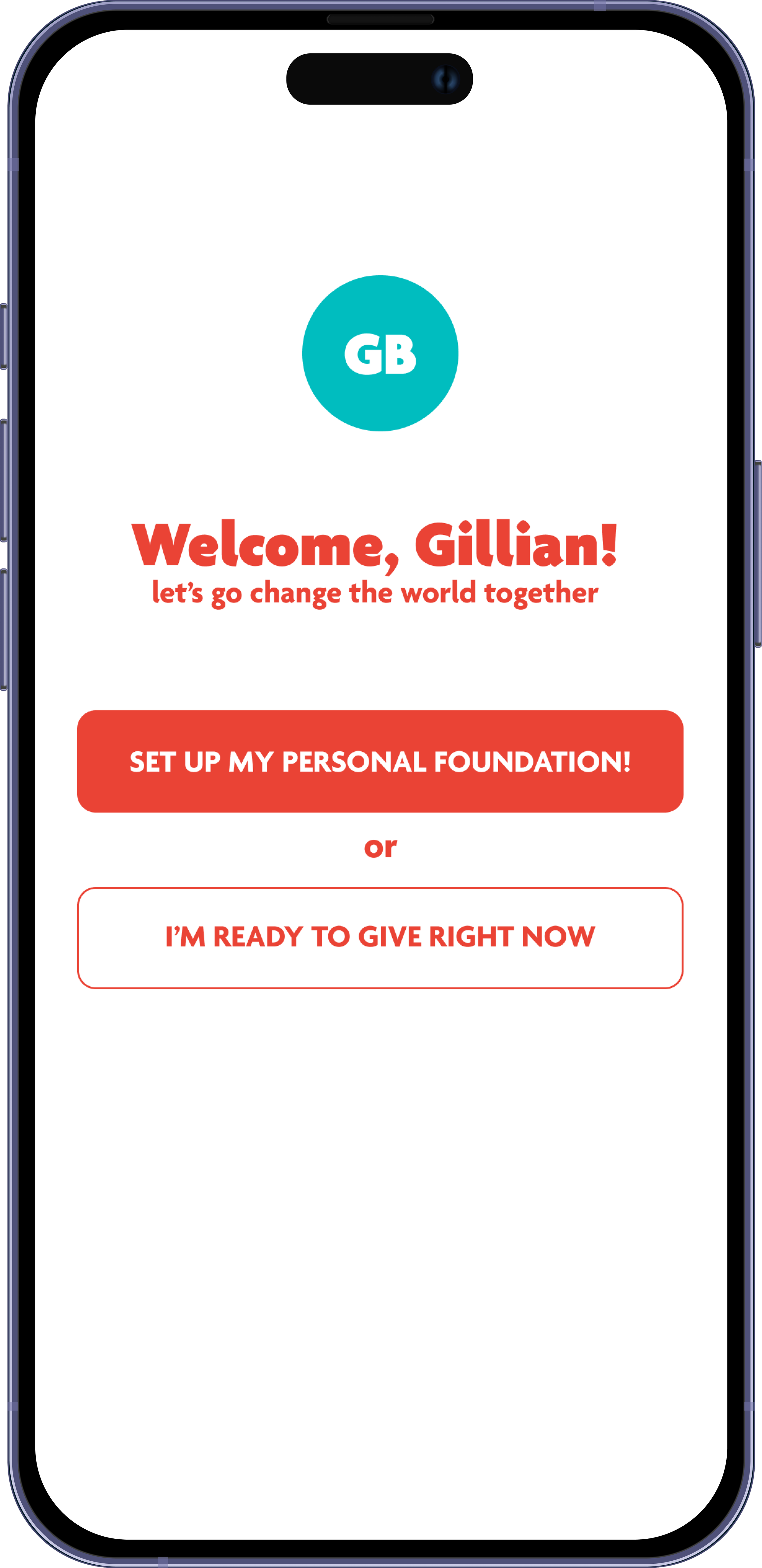
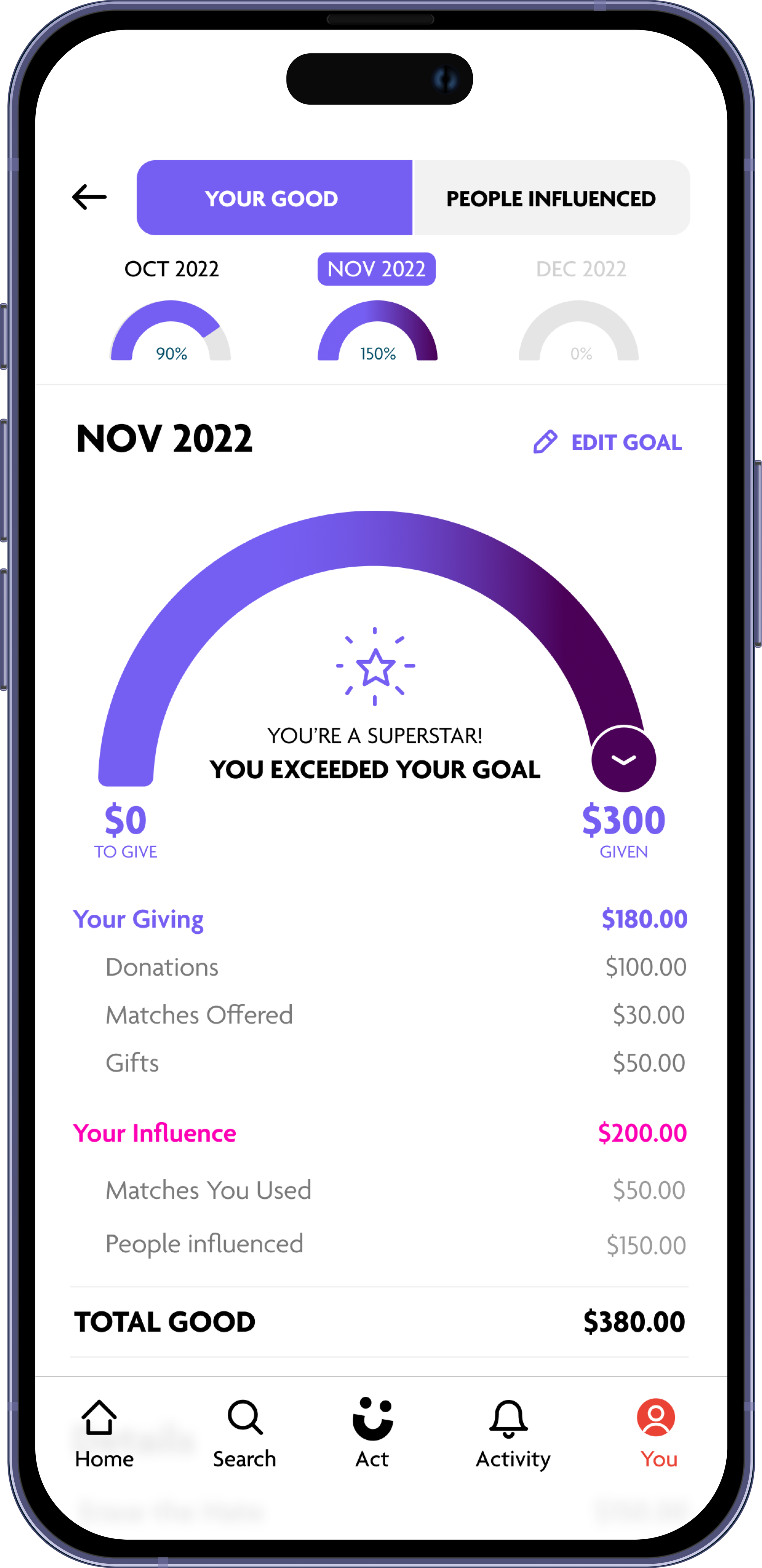
UI Screens
These are the final production ready designs
In November 2022 we released the rebuilt version of Cauze on both app stores. The entire project from concept to release took just over 8 months - with a phased rollout and testing period that took 6 days. You can download Cauze via the link below.


