In January 2020 I came up with an idea for a platform that would enable users to gift items from small businesses and send them to anyone as a digital coupon. The coupon could be redeemed or paid forward to someone else if the recipient wished. That idea became WELOLO which i cofounded with 3 other partners. I took on all the design responsibility as that was my area of expertise. I had to design a proof of concept within a short period of time so as to pitch for a seed investment. I was responsible for the following:
Challenge
-
I had come up with the name but we needed a brand that would be simple and instantly recognizable.
-
We had initial interest from a couple of angel investors who would provide seed capital but this required a proof of concept. We decided we could deliver this via design prototypes
-
Working with a transatlantic team of developers who later joined the company, I managed the translation and subsequent building of the webapp.
ROLE: Lead Designer / Project Manager
DATE: January 2020 - March 2022
TOOLS: Figma, FigJam, Photoshop, Illustrator, Asana, Usability Hub
Concept outline
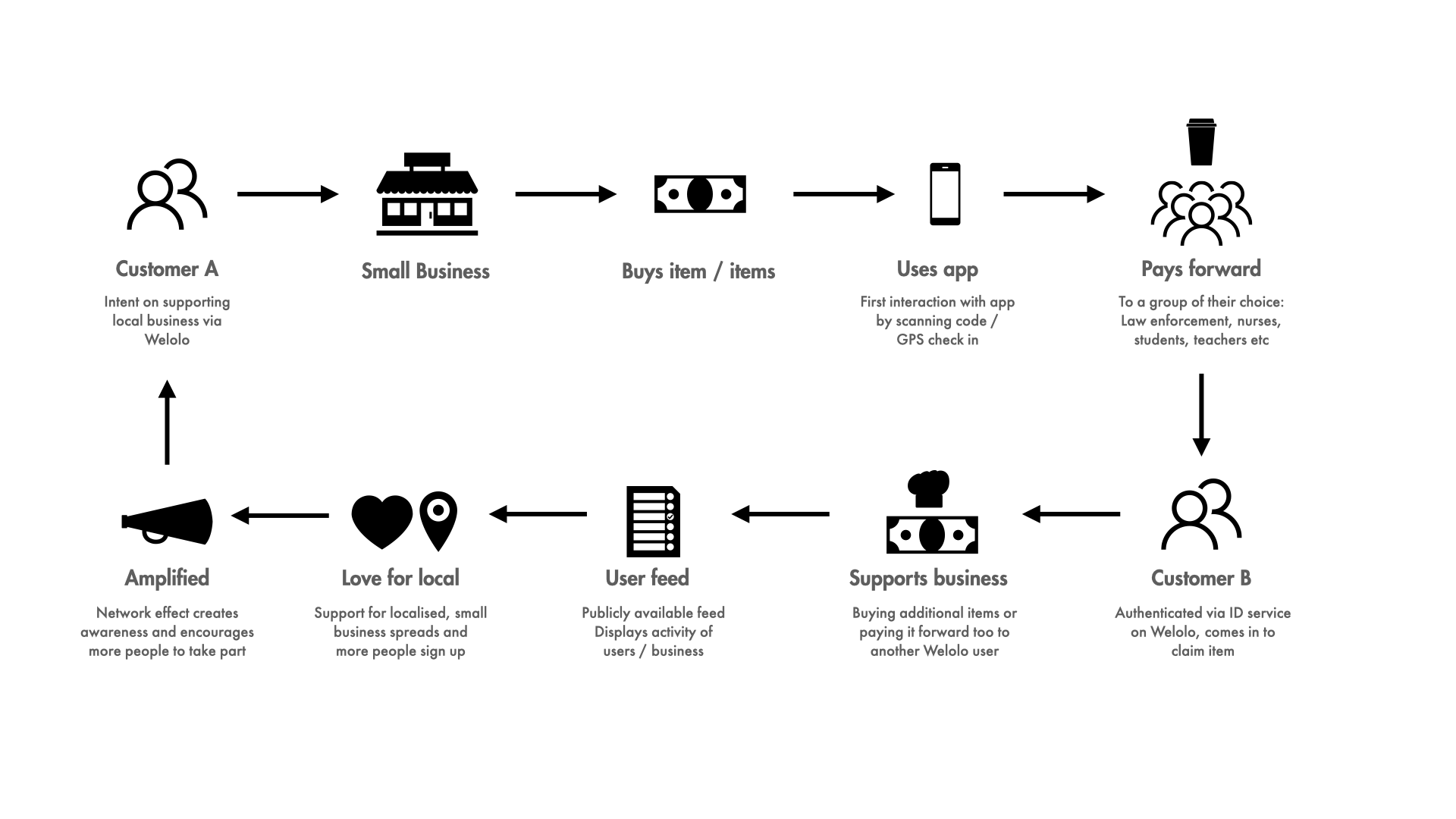
This was the high level hypothesis of how the concept would work. It illustrates user intent based on research we conducted with a test group of businesses owners, community members, and a small focus group we convened.
Test Group Comments
-
It has to be so easy that my 71 year old mother in law should be able to walk into a coffee shop, be asked to scan a QR code and everything starts to happen as if i were there guiding her along. It has to pass the 'mother in law' test.
Usability hub tester
-
I've been trying to find a way to send a friend a coffee virtually that they can pick up whenever they want. I dont like digital gift cards because they all suck. This might be what I've been waiting for!
Focus group user
-
I love it. But I would also say it has to be so simple and low effort for my store staff so they dont have another thing to learn in the store. The idea of being able to support first responders, healthcare workers, military members and vets is incredible.
Boise business owner
User Flow
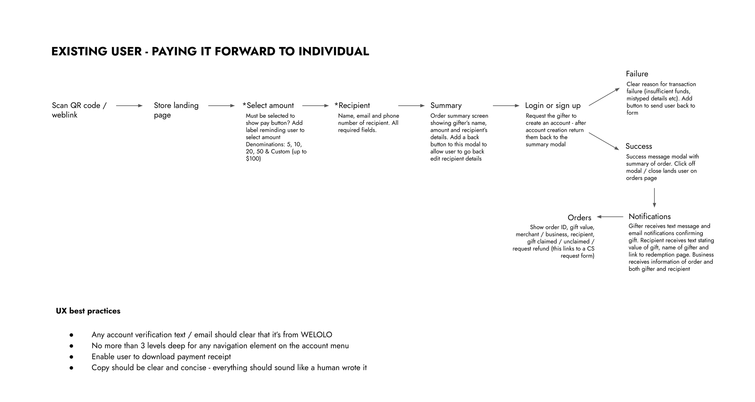
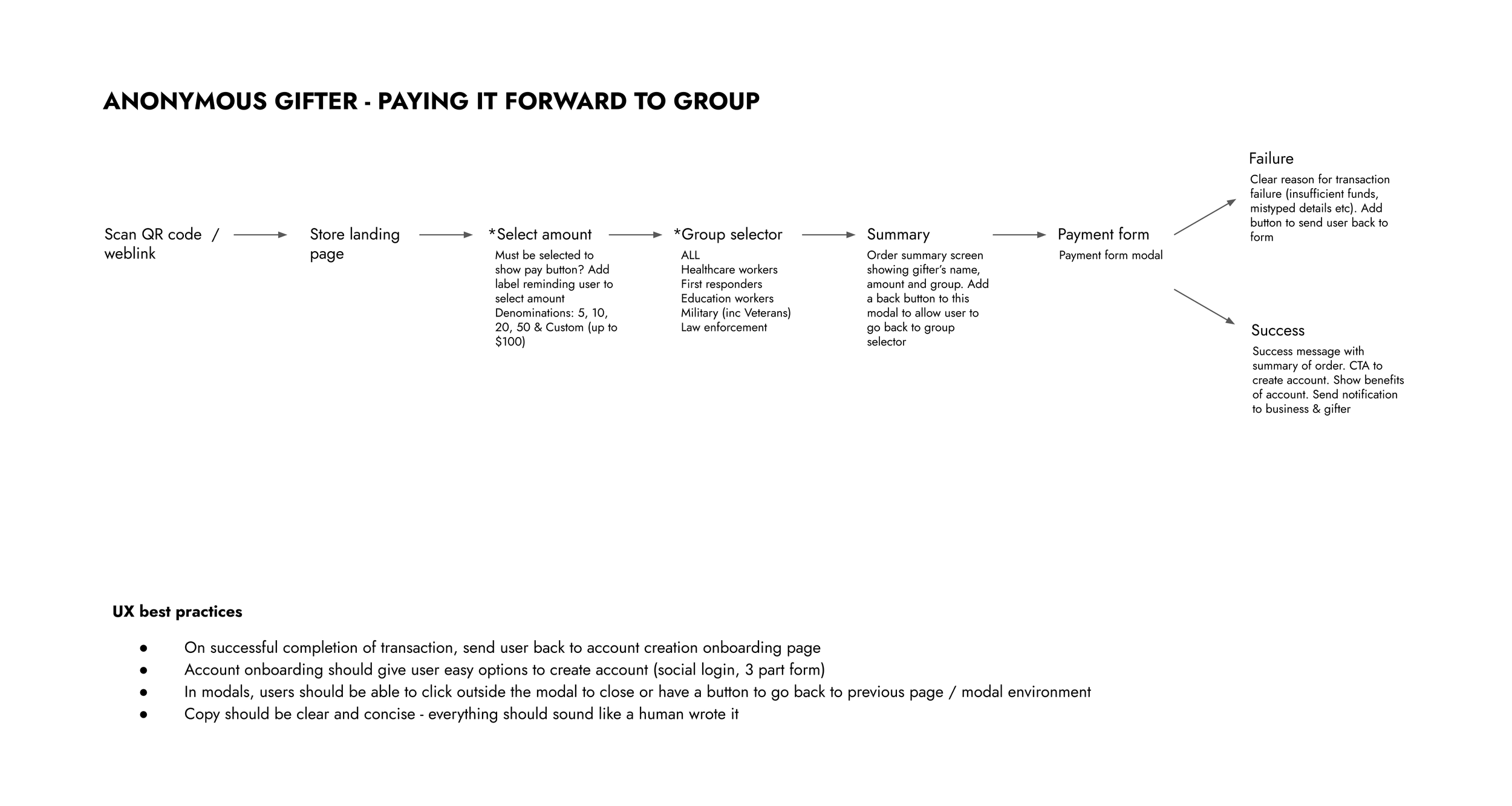
With a compressed timeline, I had to be agile in the way we approached putting all our research into action. We chose to forgo the traditional user journey tools and used Google Slides to collaborate on user flow scenarios based on how we wanted the experience to be for the user.
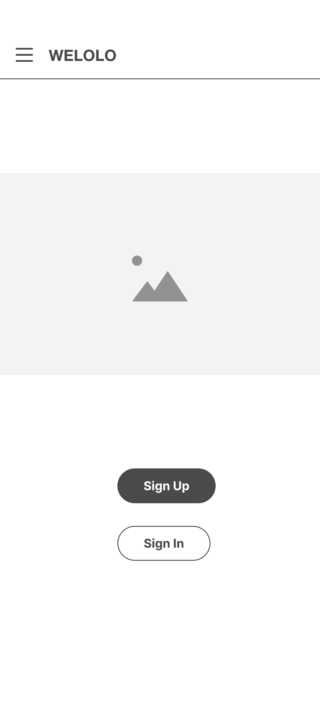
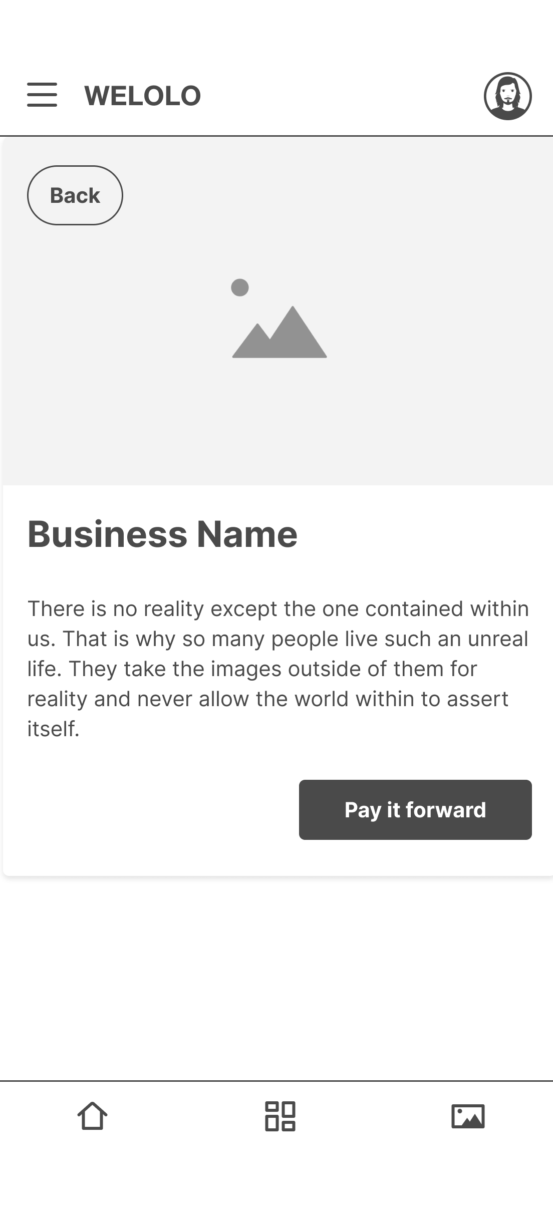
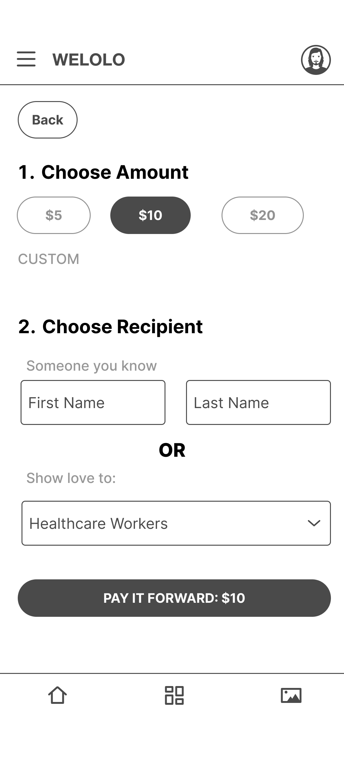
Wireframe samples
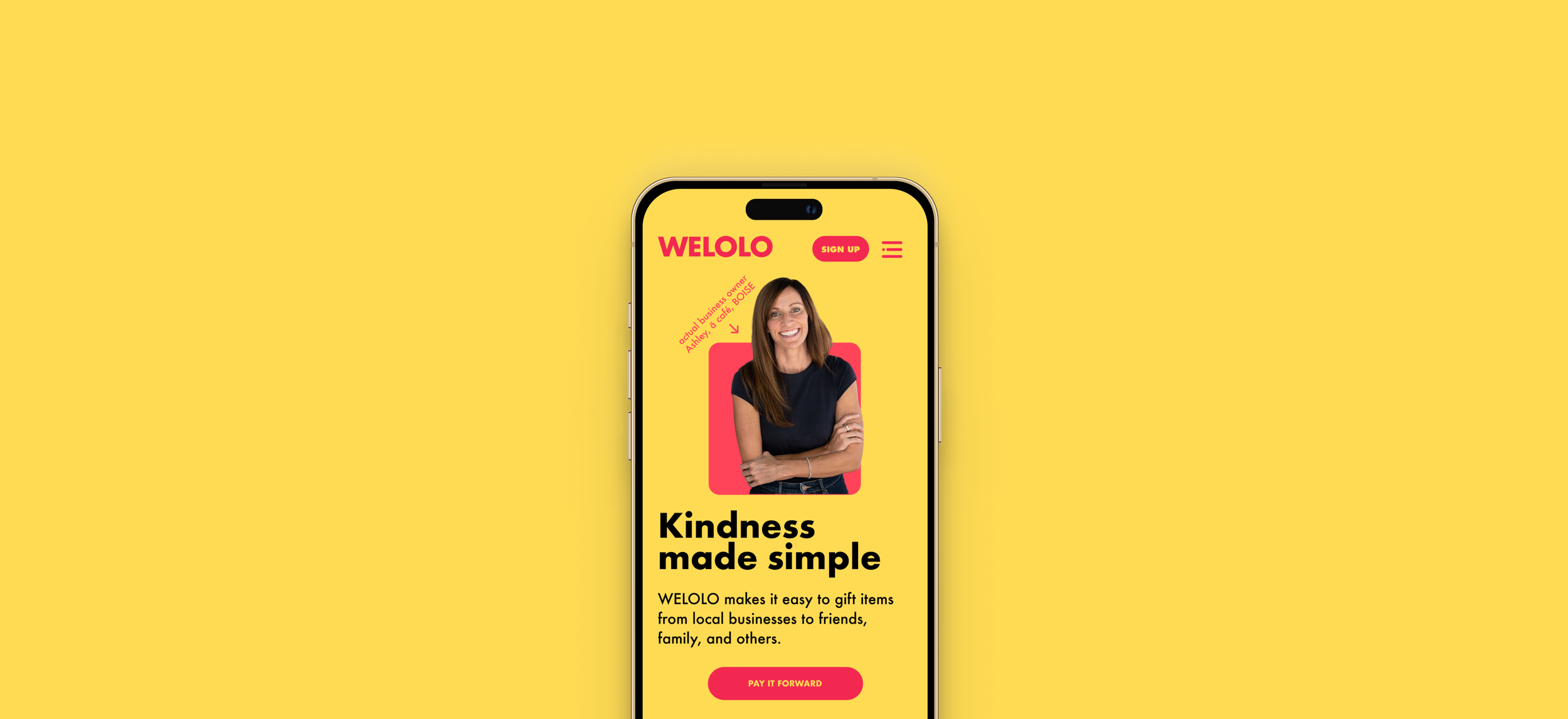
Brand design
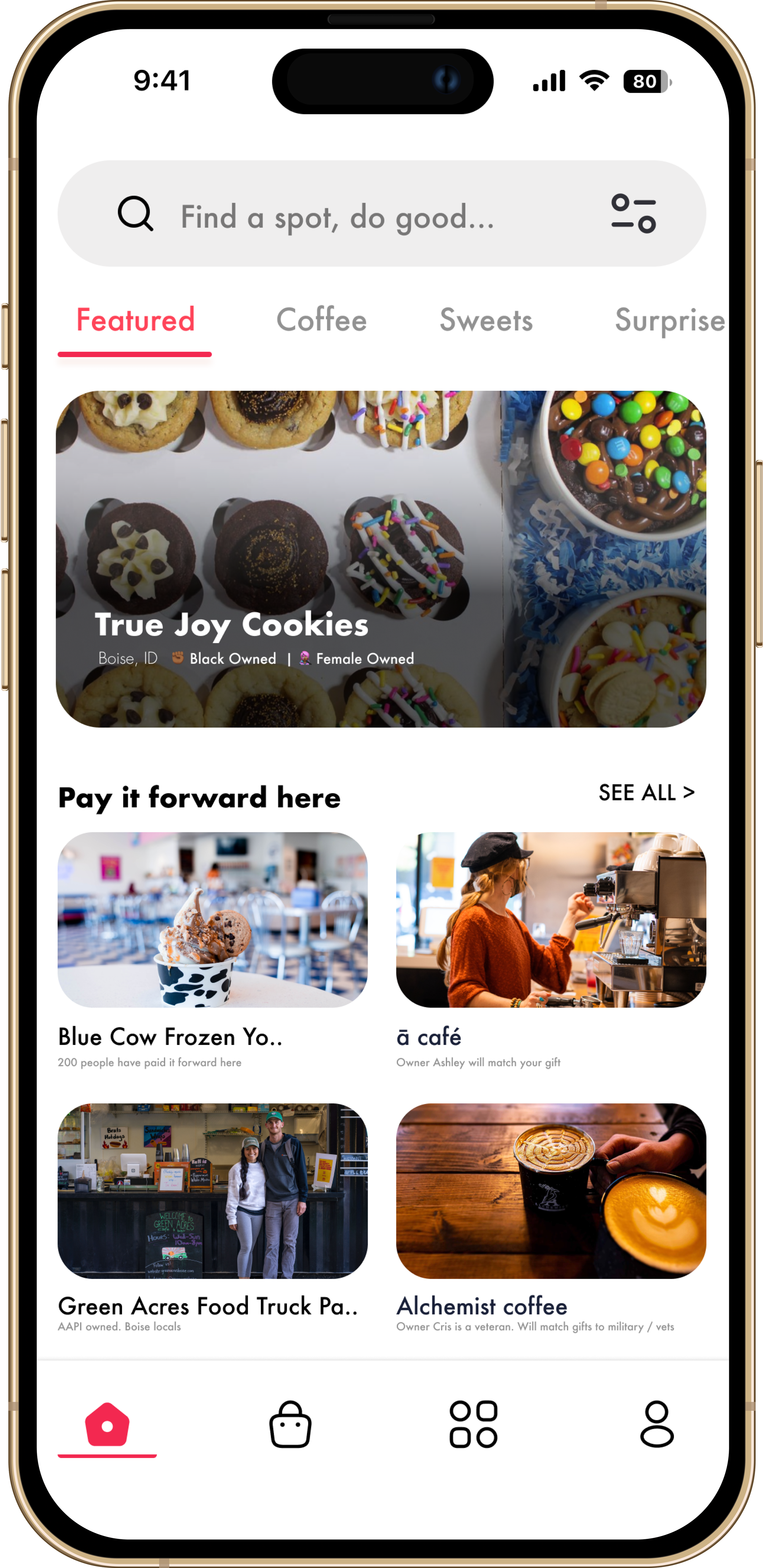
UI Screens
These are the screens as designed in 2020. The current design language of the live app may vary.
WELOLO was released as a web app beta in the summer of 2021. We ran the beta with a total of 6 businesses in the Boise area while we tested the service. We attracted a further injection of investment in late 2021 with a view to building the iOS and Android versions of the app. I left the company in March 2022 to pursue a new challenge. The webapp is available online and the team still plans to release a mobile app in the near future.

